Henlo 🐶 🐱
Pet Adoption Responsive Website
Passion Project | Role: UI/UX Designer | Timeline: 3 months
Preface
In 2020 with the pandemic sweeping the nation, pet-related businesses benefited. From an increase in monthly website visitors to increased vet appointments to increased pet food sales, humans wanted to “hunker down” with a furry friend.
Meanwhile, a friend of mine who had been casually browsing for pets shared his frustration for pet adoption/breeders’ websites feeling “outdated and stuck in the 90’s.” Having an adoration for pets but lacking pet-owning experience, I felt this would be a great portfolio project to explore a growing industry and show my visual design skills.
Empathizing with Users
I started by putting myself into the shoes of a prospective pet owner browsing through Petfinder.com, AdoptaPet.com, and Petango.com—all of which appeared on Google’s first page of search results. Through this Competitive Analysis, I hypothesized a list of potential issues to observe for in later user testing.
Next, I interviewed Millennial prospective pet owners. Users ranged in pet-owning experience, income levels, and physical activity levels. In addition to walking through the websites I mentioned prior, I asked questions to understand their unique views/needs.
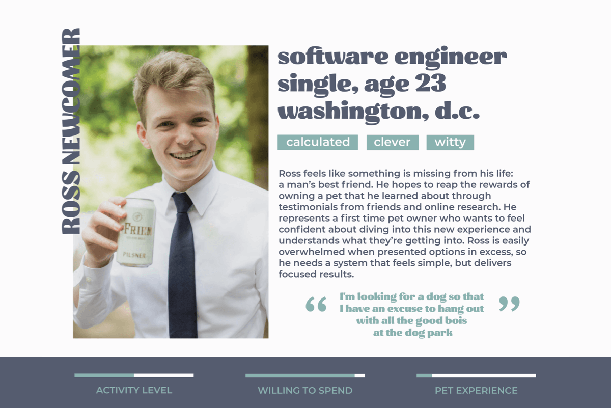
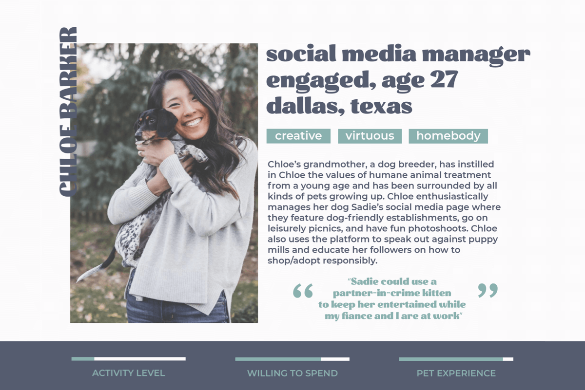
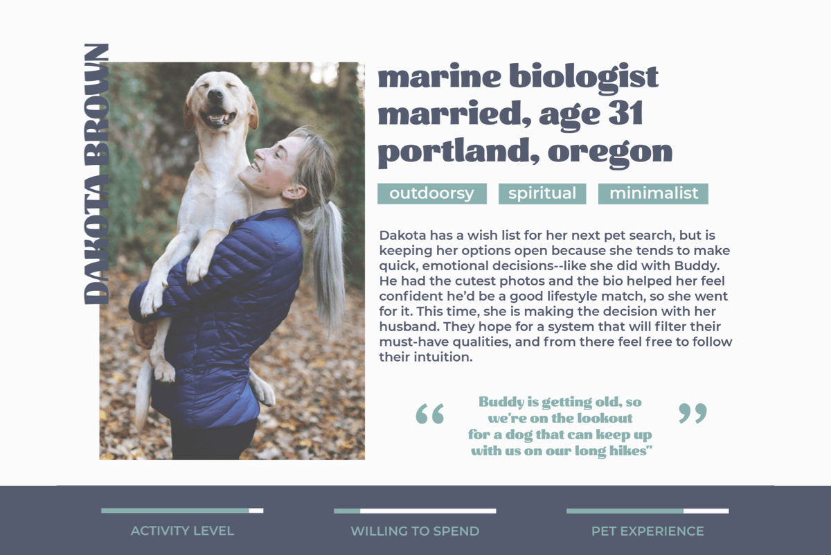
Opportunity Statement
Create a simpler UI balancing playfulness and sophistication that resonates with Millennial Americans.
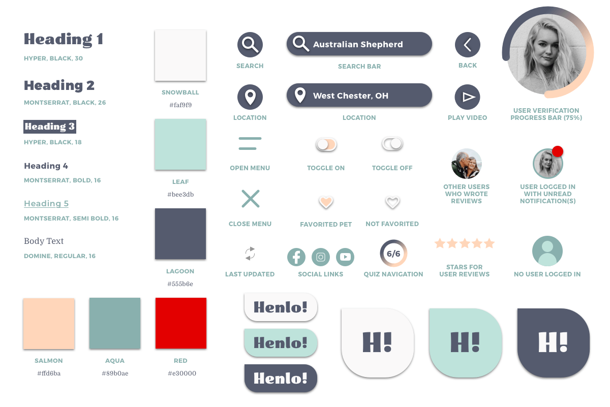
- Creating a clean UI with clear hierarchy, omission of ads, trend-driven illustrations, and colors that are easy on the eyes for long browsing sessions.
- Establishing trust with an easily-located Mission page, testimonials/press on the homepage, and using with the right UX copy.
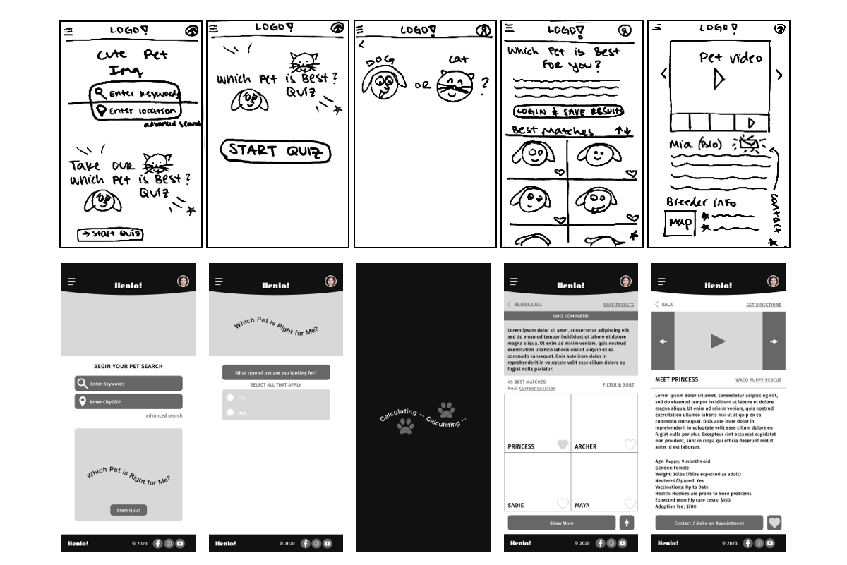
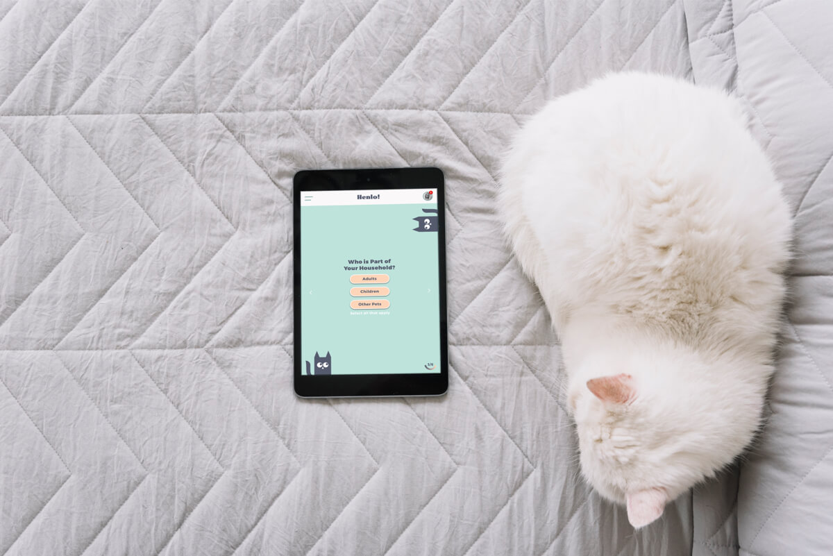
- Designing a fun, inclusive pet quiz without the need to be logged in.
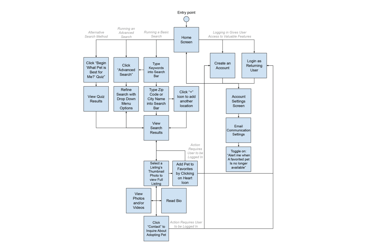
Iterative Path
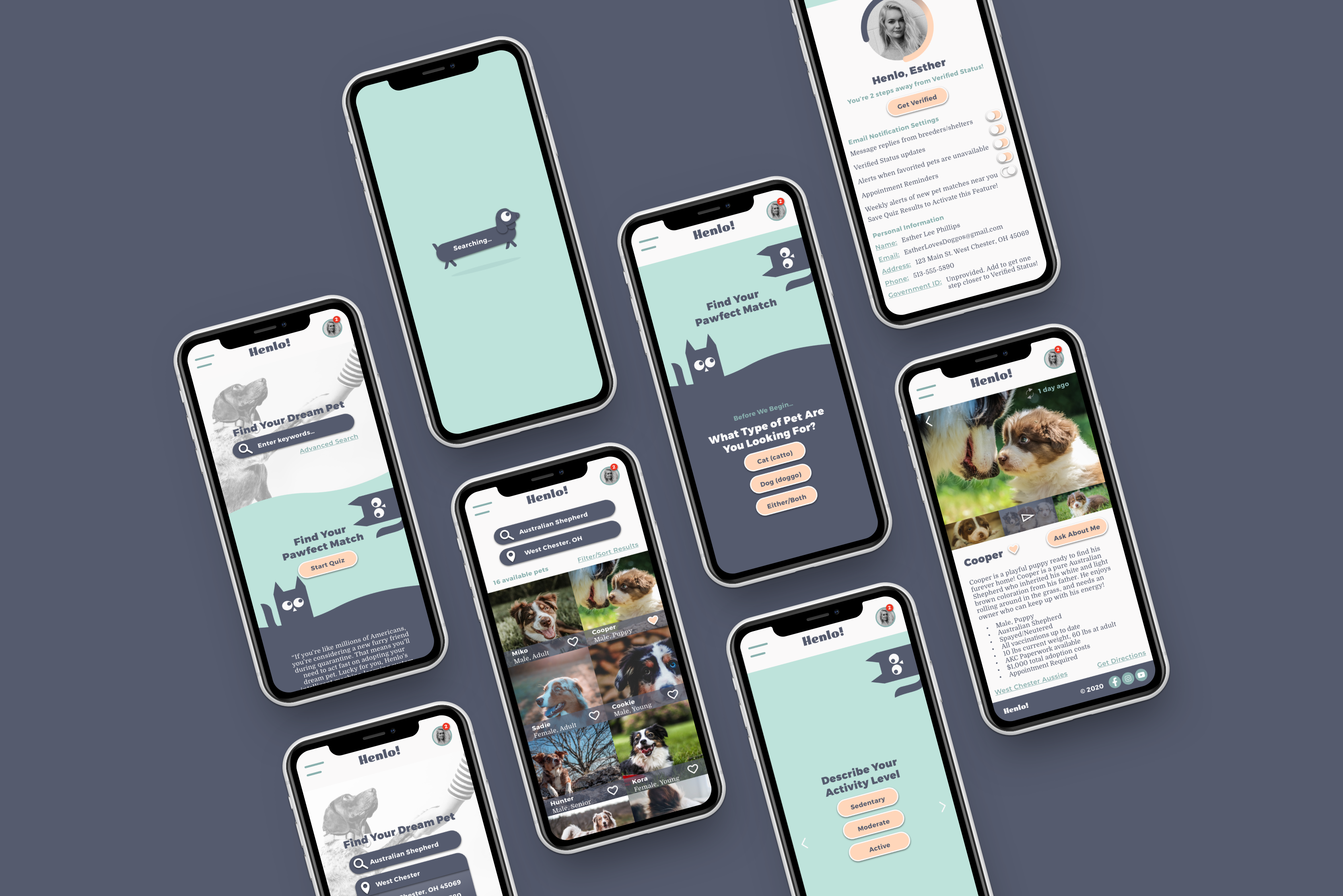
Final Solution
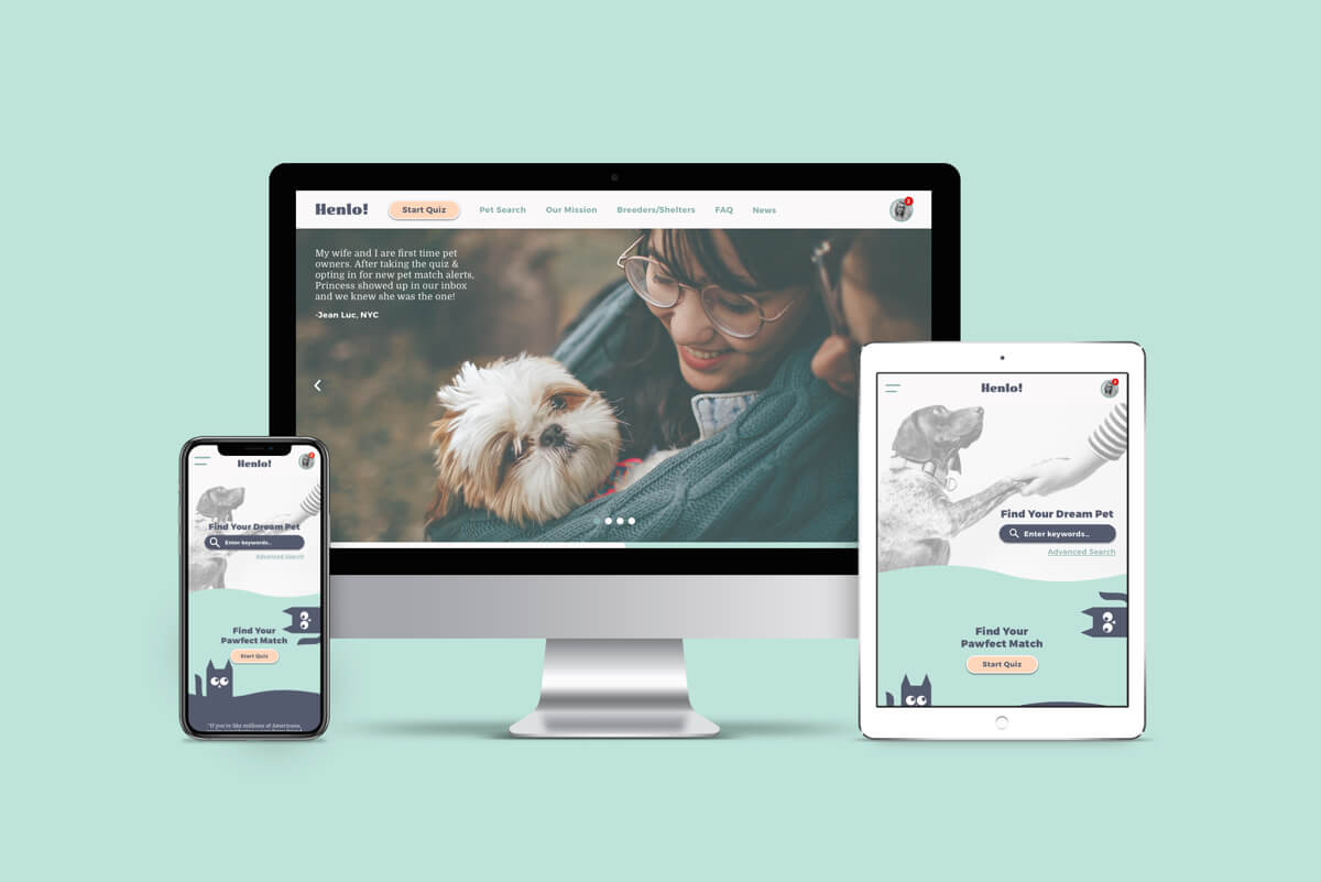
Tablet and Desktop responsive screens are available upon request.
Looking forward
I have received feedback that although I’m solving for Millennial users, the real users would range in age. Therefore, my next step will be to test this prototype on a broader demographic of users, especially Gen Y and Baby Boomers, to make improvements. Visually, I would change the body text to be set to black as I’ve discovered this is best practice. Also, now that I have HTML, CSS, and Javascript skills, I want to bring small chunks of the website concept to life through animations such as the pet adoption quiz.